Jewelry photography is one of the fastest ways to make a small jewelry business look trustworthy, clear, and worth paying attention to. If your photos are dark, cluttered, or inconsistent, shoppers may assume the jewelry itself is less professional than it really is. The good news is that strong jewelry photography does not require a studio budget or a giant camera setup. What it does require is a repeatable process, a clear visual goal, and enough understanding of light, background, and scale to show the piece honestly. For founders, that combination matters more than any trendy edit preset.
Start with the job of the photo, not the camera. A product image for a ring listing should answer different questions than a lifestyle image for Instagram or a homepage banner. The product image needs clarity, true color, and detail. The lifestyle image needs context, mood, and a feeling of how the piece fits into someone’s life. If you try to make every image do everything, the results usually become muddy. This is why many jewelry brands benefit from separating their image library into use cases: collection pages, product pages, email campaigns, social media, and ads. That structure makes your visual marketing easier to maintain over time, and it helps you avoid reshooting the same item in different ways without a plan. If you are still shaping your product assortment, it can help to review pricing handmade jewelry for profit without guesswork alongside your photo plan so your presentation matches your margins.
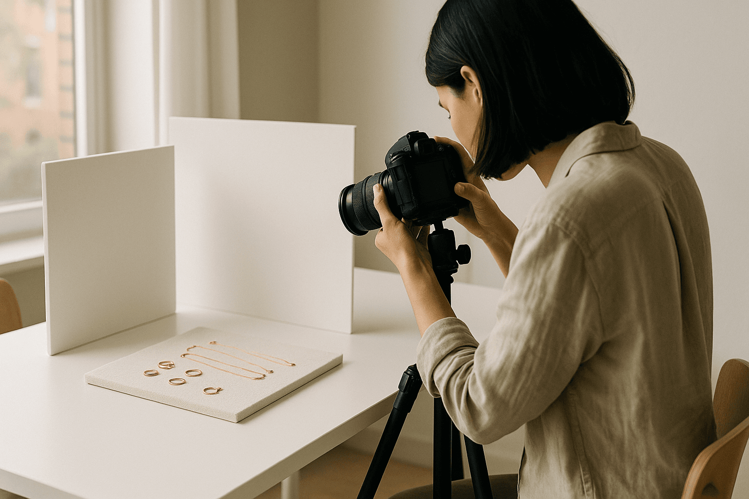
Your first technical decision is lighting. Jewelry reflects almost everything around it, which means bad light becomes obvious immediately. Soft, even daylight is often the easiest starting point because it reduces harsh shadows and makes metals and stones easier to judge. Place your setup near a bright window, but avoid direct sun that creates blown highlights and deep contrast. White foam board, poster board, or even a folded sheet of white paper can bounce light back into shadows. If you use artificial light, keep the source diffused so you do not get pinpoints of glare. The goal is not to make the jewelry look unrealistically perfect; the goal is to make it readable, flattering, and consistent from one product to the next.
Next, build a simple shooting station that you can recreate every time. A table near a window, a neutral background, a small tripod, and a few positioning tools are enough for many founders. For flat pieces like earrings or chains, use a clean backdrop with the item laid flat and carefully aligned. For rings, necklaces, and bracelets, shoot a mix of straight-on, angled, and close-up detail views so the shopper can understand scale and construction. Consistency matters more than decorative variety. If every image is framed differently, your collection pages will feel chaotic. If every image follows a similar structure, even a small catalog can look premium and organized.
Composition should support the product, not compete with it. In jewelry photography, clutter is expensive because it distracts the eye from the finish, shape, and proportions that actually help a customer decide. Use props only when they explain size, use, or story. A ring on a carefully chosen hand shot can show scale, but a pile of props around it usually looks like indecision. A necklace can be photographed on a bust, laid flat, or worn, but each format should have a purpose. Keep negative space around the item so details breathe. If your jewelry has fine texture, capture at least one close detail image; if it depends on scale, include a reference shot. Those choices make your listings more useful and reduce the chance of returns caused by misunderstanding.
Real brand lesson: Mejuri is often associated with a clean, direct visual style that helps shoppers focus on material quality and everyday wearability. The practical lesson is not to copy the look itself, but to understand why it works: the brand’s images make the product feel easy to evaluate. That is a useful standard for any jewelry founder. Your photos should help a shopper answer simple questions quickly: What does it look like? How big is it? What metal or finish am I seeing? How does it behave in light? When the image answers those questions, the rest of your marketing becomes easier because your audience is spending less energy decoding the product and more energy imagining ownership.
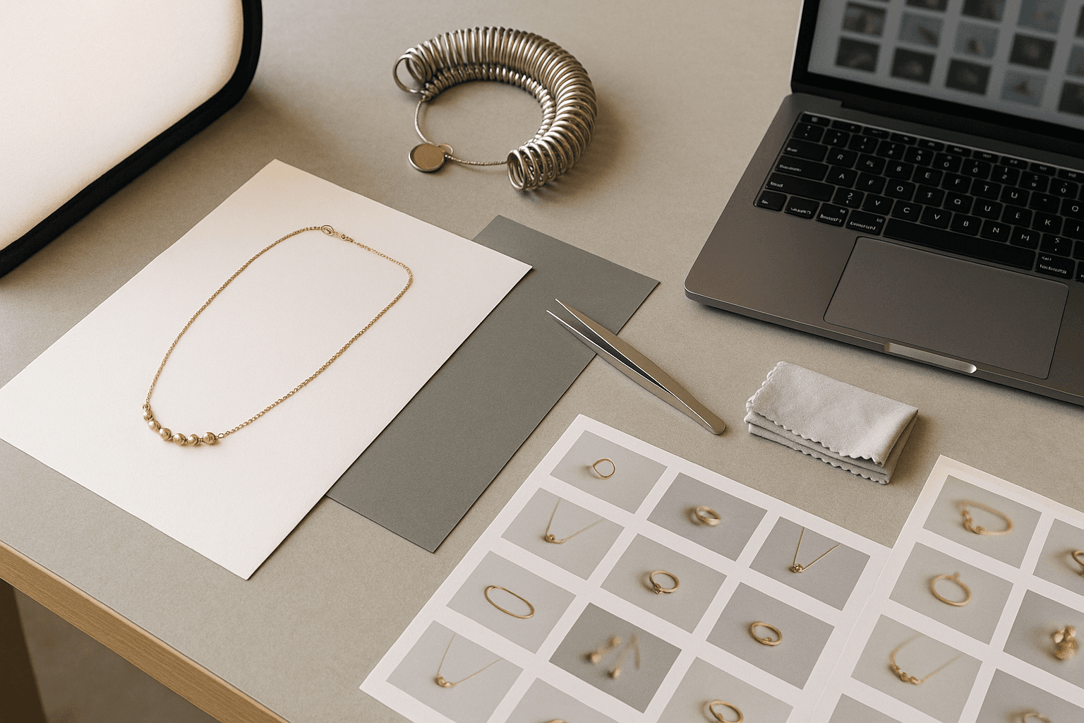
Color accuracy is one of the biggest trust signals in jewelry photography. Metal tones, gemstone hues, and enamel colors can shift dramatically under different light sources and editing styles. If your gold looks too orange, your silver looks blue, or your stones lose saturation, customers may feel misled even if the piece is high quality. Keep your editing restrained and consistent across your catalog. Adjust exposure, white balance, and contrast before reaching for dramatic filters. If you need a practical reminder that photos are part of a broader trust-building system, the Google helpful content guidance is a useful reference for making your site genuinely useful rather than merely decorative. That principle applies to images too: helpful images answer real shopper questions.
One of the most overlooked parts of jewelry photography is scale. Many returns and disappointed customers happen because a piece looked larger or smaller than expected. To prevent that, show the item beside a familiar object only if it does not clutter the frame, or better yet, include a model shot, a ruler-free size reference through clear product dimensions, and a secondary angle that shows depth. This is especially important for rings, studs, pendants, and chain necklaces, where width and drop length can be hard to infer from a front-facing image. Good scale photography reduces friction in the buying decision and supports stronger customer service because shoppers arrive with fewer surprises. If you need a system for turning attention into sales after the click, pair this work with a simple marketing plan for a jewelry brand so your visuals and messaging stay aligned.
Action points: this week, photograph your best-selling item in three formats: a clean hero shot on a neutral background, a close-up detail shot, and a scale shot that shows how the piece looks when worn or placed near a clear reference point. Edit all three using the same preset or workflow so the tones match. Then review your current product page and replace any image that does not answer a shopper question. Finally, write down the exact photo setup you used, including background color, light direction, camera distance, and editing steps, so you can repeat the process for the next product drop without starting over.
Your editing workflow should be simple enough to repeat after a busy production day. Start by sorting out blurry or uneven images, then correct white balance and exposure, then crop for consistency. Avoid over-sharpening jewelry because it can create harsh edges around stones and metal reflections. If your catalog includes multiple materials, aim for a consistent visual standard rather than trying to make every product look identical. Handmade pieces often have natural variation, and your photography should communicate that variation honestly. For founders selling on Shopify or another ecommerce platform, image order matters as much as image quality. Put the clearest hero image first, then the most informative supporting images, then a lifestyle image if it strengthens the story. The Shopify guide to starting a jewelry business is a helpful reminder that presentation and operations grow together, not separately.
Real brand story: Catbird is a useful example of how a jewelry brand can build a recognizable point of view from a smaller retail base. The operational lesson is that strong visual consistency becomes part of the brand language. You do not need a massive team to do this well. You need a repeatable system for background, lighting, cropping, and file naming so that every new piece can be photographed in the same visual family. That consistency helps your collection pages feel cohesive and makes your brand easier to remember, especially when customers browse on mobile and compare several items quickly.
The best jewelry photography is not just pretty; it is commercially useful. It supports conversion, reduces confusion, and gives your brand a more established look even if you are only selling a few SKUs. If you treat photos like a growth asset instead of a last-minute task, they will pay off across product pages, email campaigns, ads, and social content. For founders starting small, that is a powerful advantage because every good image can be reused in more than one place. Keep improving one product shoot at a time, and you will build a library that makes your business look more polished with every launch.