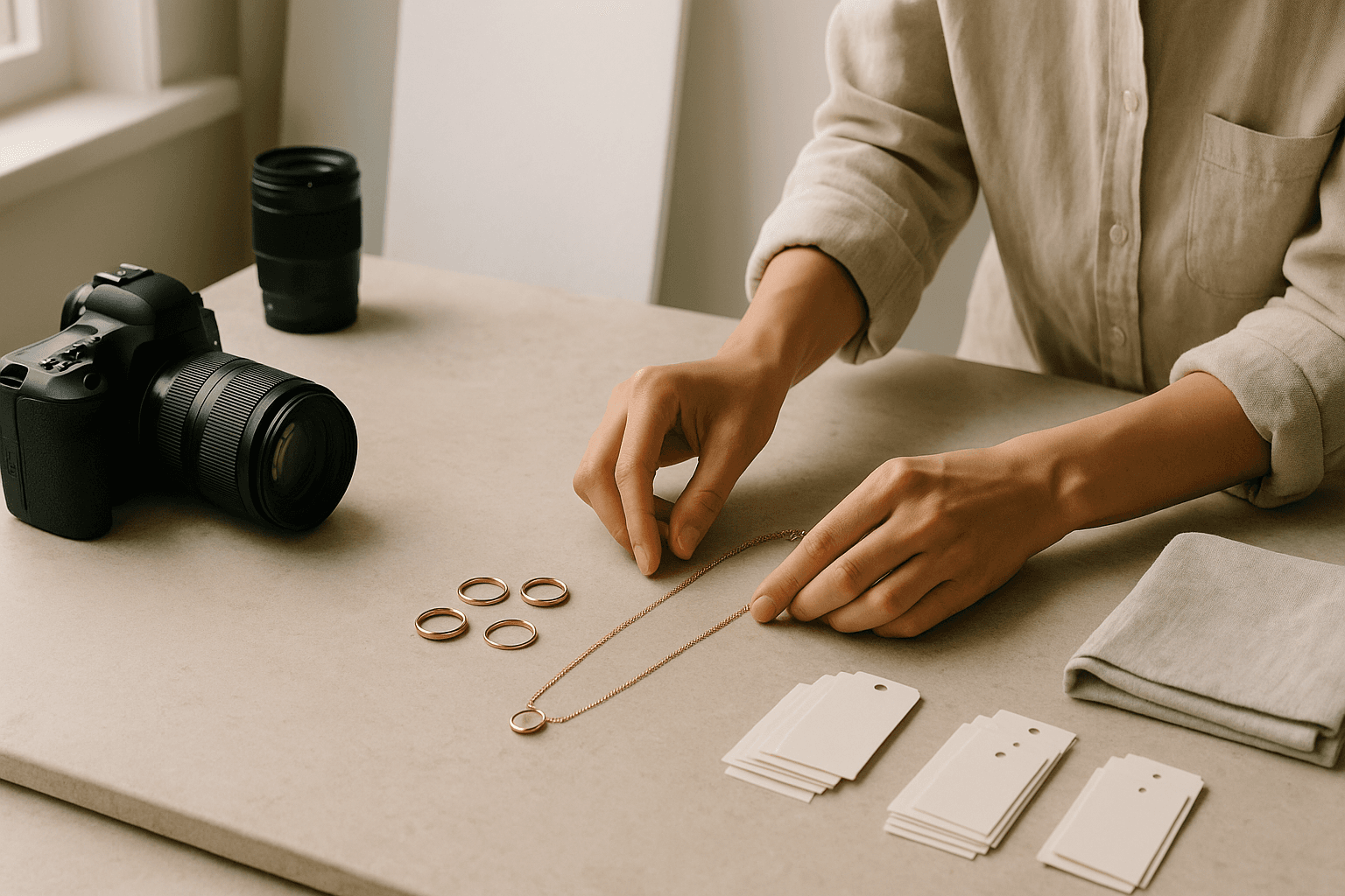
Jewelry product photography is one of the fastest ways to improve how shoppers perceive your brand, especially when you are still small and every image has to do real work. If your photos are muddy, overly filtered, or inconsistent, buyers may assume the product is lower quality than it really is. Good photography does not mean expensive photography; it means clear, accurate, repeatable images that show scale, finish, and detail. For a jewelry founder, that starts with planning the shot list before you pick up the camera, because the most useful photos are the ones that answer a buyer’s questions before they ask them.
Before you style a single necklace or ring, decide what your images must accomplish on the product page. A shopper usually wants to know the exact color, the texture of the metal, the size relative to the body, whether the clasp or back matters, and how the piece looks in normal daylight. That is why jewelry product photography should always include a mix of clean white-background images and lifestyle or detail shots. If you want a broader foundation for setting up your brand systems, this guide to starting a jewelry business is a useful companion because photography works best when it supports a clear product and audience strategy.
A simple shoot plan usually has four image types: the hero image, a close-up detail image, a scale image, and a context image. The hero image should be the cleanest version of the product, often on a plain background with no distractions. The detail image should reveal craftsmanship such as stone setting, chain links, solder points, or surface finish. The scale image should show the piece next to something familiar, such as a ring on a model hand, a necklace laid flat beside a ruler, or earrings paired with a common object that does not compete with the jewelry. The context image should suggest how the piece fits into daily wear or gifting without creating visual clutter.
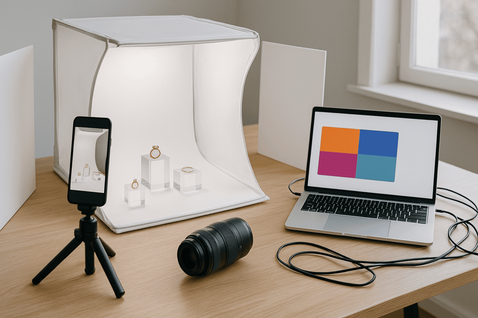
Lighting is where many jewelry photos fail, because metal and stones reflect everything around them. The easiest fix is to use soft, diffused daylight or a large soft light source bounced through white fabric, parchment, or a light tent. Hard direct light makes shiny surfaces blow out and throws distracting hotspots across polished pieces. If you photograph on a window setup, place the jewelry where the light is bright but indirect, then use white foam board to lift shadows from the darker side. For extremely reflective items, moving the product by even a few inches can change the entire result, so test angles patiently instead of assuming the first frame is the best frame.
Camera settings matter less than consistency, but they still make a difference. Use a tripod whenever possible so your framing stays stable across the full set of images. If you are shooting with a phone, lock exposure and focus so the image does not shift between taps. If you are using a camera, choose a smaller aperture for more depth of field, but not so small that the image becomes soft from diffraction. Most importantly, keep the white balance consistent from image to image so your gold, silver, and gemstones look true to life. Shoppers notice when one photo makes a necklace look warm yellow and another makes it look flat or gray.
Styling jewelry is less about decoration and more about clarity. Too many props can hide the product, confuse the scale, or make the piece look less premium. Use props only when they support the story: a linen cloth for softness, a neutral tray for structure, a stone slab for a more elevated brand mood, or a clean hand model for scale. Do not use props that compete with the piece, and avoid trendy backgrounds that may age quickly. If your jewelry is minimalist, the image should feel airy and precise; if it is organic or handmade, the setup can be tactile and imperfect, but the craftsmanship still needs to be easy to see.
Real brand lesson: Mejuri is often discussed as a brand that pairs frequent product drops with clear material education, and that is a useful lesson for smaller founders. Even if you are not launching at scale, your images should educate as much as they attract. Show the clasp if it matters, show the stone size if it changes expectations, and show the finish if it affects price. Product photography becomes stronger when it reduces uncertainty, because uncertainty is what slows purchases. That is also why visual consistency across your catalog matters: it helps shoppers compare pieces fairly instead of guessing what the item will actually look like when it arrives.
Editing should improve clarity, not redesign the jewelry. Basic retouching can correct color cast, brighten shadows, remove dust, and crop for consistency, but it should not erase texture or alter proportions. If a pendant is small, do not enlarge it in a way that misleads buyers. If a gemstone has visible inclusions that are part of the material, do not make every stone look identical through heavy smoothing. Honest editing builds trust, and trust is especially important in jewelry because buyers cannot feel weight, movement, or finish online. For guidance on search visibility once your images are ready, Google’s SEO Starter Guide is a helpful reference for the basics of indexable, useful content.
The best jewelry photos also support your pricing strategy because premium visuals justify premium positioning. When a customer sees sharp macro detail, clean lighting, and thoughtful composition, the product feels more intentional and often more valuable. That does not mean you should inflate expectations; it means the imagery should match the level of craft you are charging for. If you are still deciding how much margin your photography can support, pricing handmade jewelry for profit is a smart read because image quality and price perception work together. A piece that is photographed casually can look bargain-priced even when it is not.
A strong workflow will save you from repeating shoots every time you add a new product. Create a repeatable shot checklist for each listing: front view, side view, clasp or back view, close-up, scale image, and one lifestyle shot if relevant. Keep one folder for raw files, one for edited finals, and one for images assigned to each SKU so you can find them later. The workflow matters as much as the creative side, because product photography tends to become a bottleneck when founders shoot in bursts and then cannot tell which image belongs to which variant, metal type, or chain length.
Action points: this week, build a tiny photo system instead of trying to solve everything at once. First, choose one background, one light source, and one editing style you can repeat. Second, photograph your three best-selling pieces in a full set of images instead of endlessly experimenting with one product. Third, compare the final images on a phone screen, because most customers will shop that way. Fourth, write one sentence under each product image set explaining what the shopper is meant to notice. If your product pages are still thin overall, a simple marketing plan for a jewelry brand can help you decide how photography fits into the rest of your content.
If you sell through Shopify or another ecommerce platform, your photos should be optimized for speed as well as beauty. Large files can slow page load, which hurts the shopping experience and can make your site feel less polished. Export images at the right dimensions, compress them carefully, and keep naming conventions organized so uploads stay simple. The Google helpful content guidance is worth reviewing because the same principle applies to product imagery: make it genuinely useful for the shopper, not just decorative for the brand. A clear photo that answers a question is more valuable than a dramatic photo that creates confusion.
Your product photography does not need to look like a major studio campaign to work. In fact, many founders win by being more consistent and more informative than larger brands with bloated creative processes. The goal is not perfection; the goal is confidence. When shoppers can understand the size, finish, and style of your jewelry quickly, they are more likely to add to cart and less likely to hesitate. Build a repeatable system, keep your visuals honest, and treat every image as part of the selling process rather than a last-minute branding task.